How to maximise your donation conversion rate
The conversion rate of your charity's donation page has a direct, ongoing and often significant impact on income. Here's everything you need to know about maximising your donation conversion rate.
Table of Contents
Spreading the word about the wonderful work your charity does is a vital – and often challenging – task. If you’ve managed to get eyes on your website or donation page, you’ve already achieved something worthy of hearty congratulations. But unfortunately, that’s only half the battle. Moving donors all the way through the donation conversion funnel and getting them to actually complete the donation is an altogether different story. In fact, the average donation page conversion rate is only 16%, meaning that a vast majority of visitors to your page aren’t actually donating any money.
We want to help charities increase the charitable donations they receive by maximising their donation conversion rate. So in this article, we’re going to look at what a good conversion rate for fundraising pages might be, and some techniques to help increase your charity’s and boost the number of donations it receives.
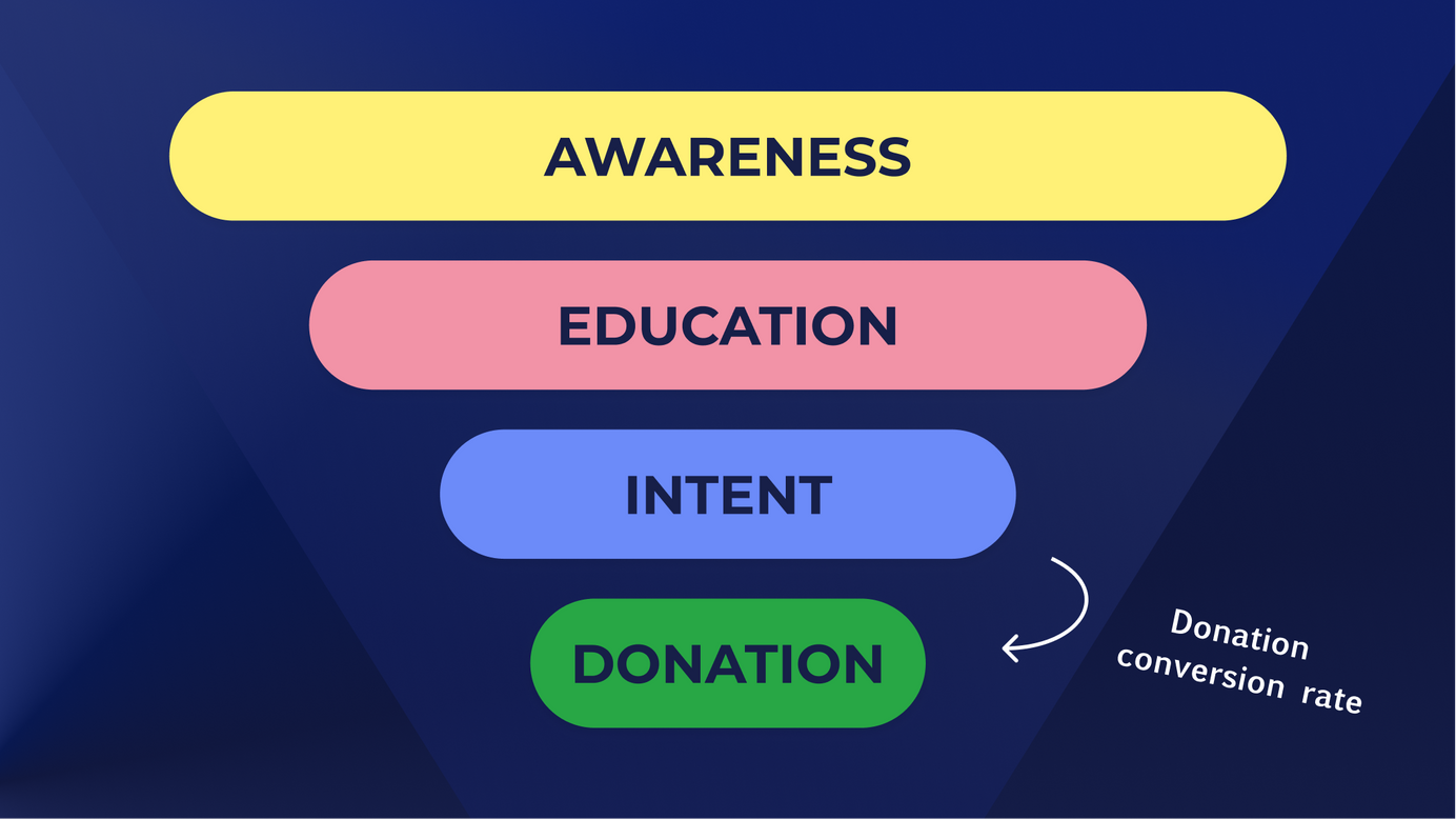
What is a donor conversion rate?
Before we dive into practical tips for finding and maximising your donor conversion rate, it’s worth taking a moment to explain exactly what we mean by the term.
It’s a very simple concept, and one that’s carefully tracked across all kinds of industries. The conversion rate is simply the percentage of all visitors to a page who convert – in other words, who take the desired action. It could be downloading a resource, subscribing to a newsletter, buying a pair of shoes, or – in the case of charity fundraising pages – making a donation.
To determine your charity’s donor conversion rate, you’ll need to make sure you’re tracking the right metrics. Specifically, the calculation requires:
1. The number unique visitors to the donation page
2. The number of successfully completed donations
All you need to do is choose a period of time (e.g. the past 30 days), and then divide the total number of donations within that time by the total number of unique visitors. Multiply that number by 100 and you have your conversion rate as a percentage.
So, for example, if 500 people visited a donation page in November, and 80 donations were made, then you would divide 80 by 500 to get 0.16. Multiply that by 100 and you’ll see the conversion rate was 16% (bang on the benchmark!).
What is a good conversion rate for fundraising?
Looking at industry benchmarks helps you put your charity's conversion rate into context. But it’s also worth remembering that different charities working in different sectors, targeting different demographics and with access to different resources may have vastly different conversion rates. So if yours is below average, don’t lose heart! You’ll find plenty of tips and tricks in this article that can help you maximise it.
According to M&R’s Benchmarks Study in 2021, that national average was – as we mentioned – 16%. That being said, for charities whose work centres around providing international aid and responding to disasters, the conversion rate was just 7%. Meanwhile, charities fighting for human rights had a staggering conversion rate of 42%! It’s not worth obsessing too much about the national average. Instead, it’s much more productive to focus on increasing your own charity’s donor conversion rate month on month by implementing the techniques we’ll outline below.
How can my charity improve its donation conversion rate?
There are lots of steps big and small that any kind of charity can take to boost its donor conversion rate and ensure anyone who wants to support you can and does.
We’ll look at lots of actions you can take in different areas, but there’s no need to feel overwhelmed! These are steps you can (and should!) take slowly and steadily, making one change at a time to measure how successful it is. Most of them are also really simple, and come with plenty of other benefits for your charity.
Ultimately, it’s all about understanding your donors and making the whole process as cohesive and convenient as possible. Get a handle on their needs and expectations, and then tailor your donation page to meet them.
So without any further ado, here are our top tips for maximising your donor conversion rate and increasing donations to your charity:
Research and understand your donors
Before you put together any kind of optimisation plan for your donation page, you need to have a clear understanding of your donors. Otherwise, you can’t possibly tailor their donation experience for them!
So the first step is researching your donors – particularly their preferences, motivations and user experience.
You might already have a strong sense of the personas and demographics of the people who give to your charity, but you can never know too much about your donor pool! In order to understand them as well as possible, we’d advise collecting qualitative and quantitative information that will help you build a picture of your donors and their experiences on your website.
How to gather qualitative information about your donors
There are a few approaches you can take to get really valuable qualitative data about donors’ current experiences when donating to your page. Some of our favourites include:
• Direct, on-screen feedback requests/pop-ups
• Donor interviews, in settings like workshops and focus groups (you could consider incentivising participation to get good numbers!)
• Website session recordings using tools like Hotjar or other behavioural analytics software
• User testing and usability testing (this could range from hiring UX and UI professionals to simply asking laypeople to test out your donation journey)
• Online reviews – remember people might already be leaving you qualitative feedback online in the form of reviews!
How to gather quantitative information about your donors
Your qualitative data is powerful, but it can become even more powerful when analysed alongside hard stats and figures. Some of these techniques do involve a little bit of technical know-how, so you might want to speak to your charity’s website provider or admin team for help gathering details. But once you know where to look, it’s all really straightforward!
• Website analytics (looking at information about who’s visiting what pages, when, where from and so on)
• Funnel reports
• A/B testing different layouts, copy and so on (again, one change at a time!) to see how different approaches impact donor conversion rates
• Heat maps
• Behaviour analytics
• Track anonymous user behaviour
• Collect live feedback
Armed with this kind of information, you’ll be able to design a donation page that caters perfectly to your user base.
Refine your messaging
As is often the case in the third sector and beyond, branding and communication are absolutely invaluable. By positioning your charity and the value you’re offering to donors (and the causes they care about), you can make donating not only easy, but irresistible.
While every area, and indeed every organisation, will have its own approach to communicating with audiences, there are a few things you can focus on refining that help to boost conversion rates.
Cohesion
This first point is another great example of why understanding your donors’ journey to your page can be so useful. You want the destination – your donation page – to match the rest of the journey. So whether your donors tend to click through from emails, see your campaigns on social media, find you through organic search engines, get inspired by TV ads, or anything else, your donation page should be clearly recognisable as belonging to your charity.
This is what Amplifi – a specialist in nonprofit communications – calls ‘surround sound marketing’, and implementing it is pretty simple. In fact, it might even save your team quite a bit of work! Essentially, it’s all about reusing the CTA (call to action), images and key messages that incited people to click to your donation page in the first place. If, for example, your campaign centres around a poorly donkey called Duncan, make sure Duncan is referenced (and maybe even pictured) on the donation page again!
Clarity and concision
Having one, simple point is often key when it comes to increasing conversion rates of any kind. People want to feel confident about what they’re doing and why when they’re taking an action online – particularly when they’re parting with money.
So although you probably have a lot to say about the value of your charity’s work and philosophy, longer copy and stories are better placed in emails or on dedicated pages of your website. The donation page itself should be directly focused on helping donors decide to donate, why it matters.
A/B testing could help you determine whether this is the case for your charity, but Forward Action have already found some interesting results with their charity clients. They tried removing the additional copy on a donation page for the Stroke Association by getting rid of all text except the headline, image, CTA and donate buttons. The results were definitive: donations increased by a whopping 58%.
Minimise distractions
It’s not just your copy you’ll want to keep succinct and unembellished. Your entire donation page might see much better conversion rates if it’s stripped right down. Keep it beautifully branded in line with your charity, of course, but remember there should only be one action you’re guiding people towards: donating.
In general, it’s good practice to try to eliminate any distractions that could lead your donor away from the donation flow. For that reason, many people limit themselves to only one link on their landing pages – the one that takes the desired action. In this case, it would be the link to make a donation. This link to 'donate' or 'give' could of course be repeated as you scroll down the page, but it should be a single destination.
So do away with any invitations for donors to ‘read more’, find out how your charity got started, or peruse case studies. They can find any information they need by navigating back to your website. But they’ve clicked through to make a donation, so let’s not distract them from the task at hand!
Donor impact
While you’ll probably want to avoid long, detailed descriptions of work facilitated by your donors’ support, a few simple, specific examples of what their money will achieve can be a brilliant way to persuade them to donate. If you can personalise and humanise your examples, you might ramp up their impact even more.
You’ve probably seen this approach before. It’s things like ‘£1 will buy a life-saving mosquito net for Sheila’; or ‘£1000 will build a school in X village’; or ‘£50 will feed a Bruno the bulldog for a month’ – all possibly accompanied by a photo or image.
Alternatively, you could highlight change your organisation has already effected, using a picture and/or testimonial quote from someone who’s benefited from your work.
Descriptive CTA buttons
Simplicity is still key, but individualising your donation buttons can be a great way to reinforce your messaging, and another reminder of why somebody should donate.

Instead of the generic ‘DONATE NOW’, you could try A/B testing specific messages on your donation buttons: think things like ‘SAVE A LIFE’, ‘HELP OUR HEROES’ or ‘GIVE THE GIFT OF HOPE’.
And remember, any and all buttons on your donation page should serve one function: allowing people to make a donation.
Continuously identify and minimise friction
Once you’ve streamlined your donation page with the steps we’ve laid out above, you’ve already gone some way to minimising friction. Donors have a cleaner, clearer journey to donation. But there’s still more you can do to make the whole process as quick and easy as possible!
Now we’re thinking less about what surrounds the donation flow, and more about the actual steps donors will have to take to get their money into your charity’s bank account. You’ll want there to be as few steps as possible.
What does that mean in practical terms? There are some really simple techniques you can try.
Firstly, make sure you’re only collecting the information necessary to complete the transaction. Do you need the donor’s job title and age for the payment to be processed? It might be useful demographic information for you, but the moment of donation is not the time to collect it. You can follow up with your supporters later. For now, let’s keep things fast and simple.
If there are fields or actions that can be consolidated to reduce the number of tapping, typing and clicking required, that can also be great for increasing your donor conversion rate.
Likewise, it’s helpful to avoid donors having to load through lots of different web pages, so that every time they think they’re done there’s another load of boxes to fill in. Equally, you don’t want to have one huge form that they take one look at and give up.
Instead, many charities find it’s most effective to take their pared down questions and divide them into two or three categories. For example, the first screen they encounter might be for personal information, then the payment amount and Gift Aid, and finally the payment itself. It can also be helpful to add a progress bar, so they know exactly what to expect and how speedily they’re moving through. In fact, Forward Action tested this method out, too. They replaced a single long-scroll form for donations to the Labour Party with a step-by-step journey, complete with a progress bar. Mobile donations jumped by 35%!
Above all, make sure you test your user experience before, during and after implementing (or even considering!) changes. Have as many members of your team as possible go through the donation process themselves, and share any issues or thoughts that arise. Is it easy to fill in every field? If anything is left blank, what error message do they see? Is it clear what they need to do to rectify the mistake? Is it quick and easy to add or remove Gift Aid?
Making sure the whole process is as smooth as possible – even when human error throws a spanner in the works on your donor’s end – is a sure-fire way to increase charitable donations.
Provide a range of payment methods
One great way to reduce friction for your donors is to offer the payment methods that are most convenient to them. Again, this is why an in-depth understanding of who donates to your charity and how they behave online is so important!
Try to build the most detailed personas you can, and tailor your process to each of them. Ideally, you’ll provide a good range of payment methods that suits every kind of donor, from the tech-wary to the time-poor, the frequent donor to the person making their first charitable contribution.
As anyone who’s made an online payment will know, filling out card details can be cumbersome and time-consuming, so offering alternatives alongside traditional payment methods is likely to give your conversion rate a serious boost. For example, services like PayPal and Apple Pay can reduce the number of clicks needed to complete a donation.
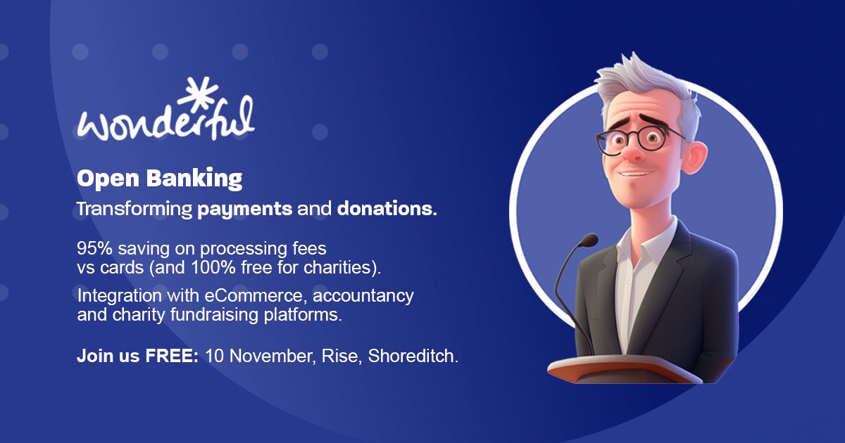
Better yet, in the UK, Open Banking offers the quickest, smoothest and safest way to pass money directly from the donor’s bank account to your charity’s. After selecting the amount they’ll give, they choose their personal bank from a menu, which opens their mobile or desktop banking, where they can approve the auto-filled payment details and voilà! No lengthy numbers to copy out or expiration dates to decipher.
Plus, not only will Open Banking increase your conversion rates, it’ll also save you a bundle on card processing fees, as no cards are processed at all! The simplicity, security and affordability of Open Banking transactions is why we provide these payments to the Wonderful Organisation and the hundreds of UK charities using the platform. It’s also why the conversion rate for Open Banking transactions is on average 85%, jumping to over 90% for returning users according to Tink’s analysis. That’s incredibly high!
Think mobile-first
While we’re thinking about harnessing new technologies and making processes as seamless as possible, remember the importance of optimising your donation page for mobile. After all, there’s no getting around the fact that a growing proportion of donations are from mobile phones.
According to M&R’s Benchmark study, one-off donations made on a mobile jumped by a massive 57% between 2017 and 2018. And the growth hasn’t stopped: from 2020-2021, the number of online donations made via mobile leapt another 30%. And with 54% of nonprofit emails opened on a mobile (according to Nonprofits Source), it’s likely that many people are clicking to your donation page on their phones. So if your donation page isn’t mobile-friendly, your conversion rate may really suffer.
Of course, if you're unsure what proportion of your user base is accessing your website on a desktop versus a mobile or tablet, you can find out by using website analytics tools (like Google Analytics). These tools can provide aggregated information about your website visitors, including the devices they're using and given that Google Analytics is free, there's no excuse not to get to grips with the basics.
Again, mobile usability is a great thing to have as many team members testing as possible. The more devices and screen sizes tested on, the fewer errors your donors will encounter further down the line! Make sure all elements on the page are clearly visible, and that it’s easy to scroll, fill in your form, and complete payment on a mobile. Here, too, Open Banking comes into its own by directing donors straight to their mobile banking app, which is safe, familiar, and easy to use.
Making your website mobile friendly can help you stand out from the crowd, and ensure donating to your charity is a breath of fresh air. Because although mobile traffic to charity websites continues to grow, research has found that only a third of charity websites pass the ‘Core Web Vitals’ assessment by Google – something that will hurt website rankings and make them harder for donors to find and use.
To make sure everything is up to scratch, you can also try running your donation page through a web page analysis tool such as Google Lighthouse. This tools tests things like how long your page takes to load and what might be slowing it down. These are all things that affect the user experience.
And remember to make your donation page accessible for all users. Here, too, there are lots of simple steps you can take, like avoiding font sizes below 14px, using visual aids and representations, adding useful alt tags to your images, and labelling form fields properly.
Instil trust and confidence
Any time that somebody parts with their hard-earned cash online, they want to feel that their money and data are secure, and they want to be confident about where the funds go. But in the third sector, trust and confidence are especially important. And while public trust in the charity sector recently rose to its highest levels since 2014, it’s unfortunately starting to dwindle again most particularly among the less economically privileged.
So for maximum conversion rates, make sure your donation page inspires confidence and trust. A big part of this is the cohesive branding and messaging we spoke about earlier, but it’s also about clearly and concisely communicating how the payment works – whichever method they opt for. You should also let donors know where their money goes, how it’s kept secure and, as we've mentioned above, how your charity puts every penny to good use.
The impact of this strategy is clear: a 2018 study by the Charity Commission found that trust in a charity – and in its handling of funds – correlates directly with people’s willingness to donate. This finding was echoed by another report in 2020.
You’re doubtless already doing the work to keep donors’ money safe, so just explaining how you do that should be a quick and easy step to boosting conversion rates! And for the strongest possible confidence, consider adding the Open Banking Account-to-Account (A2A) payments we mentioned. They cut out middlemen, and mean that no financial data is shared with your charity at all – resulting in more confidence on your donor’s side, and less risk for your charity.
The key take-aways
We’ve covered a lot of ground in this blog post, and hopefully given you some ideas to maximise your donation page conversion rate.
But remember, it’s not about implementing all these changes in one fell swoop! Instead, take the approach of small changes and continuous iteration, responding to feedback, data, new technology and donor demands. Tweak one factor at a time, and take time to measure its impact before changing anything else. Then you can pinpoint what works well for your charity, and what’s really driving your donation conversion rate up.
Equally, don’t fret too much about how high or how fast the number jumps. What we’re looking for is forward movement; it doesn’t need to be huge. There are countless reasons why people might look at your donation page, and not every person did or would have any intention of actually donating.
So it’s not realistic – or wise – to aim for a 100% conversion rate. Your charity will be better served by a more holistic approach: take the time to understand your donors, their motivations to give, and their experiences. Collect quantitative and qualitative information and carefully analyse your donation funnel, and you’ll see your conversion rates creeping up. Plus, you’ll build a stronger relationship with your existing supporters, and encourage repeat donations when they see what a smooth and easy experience it is!

